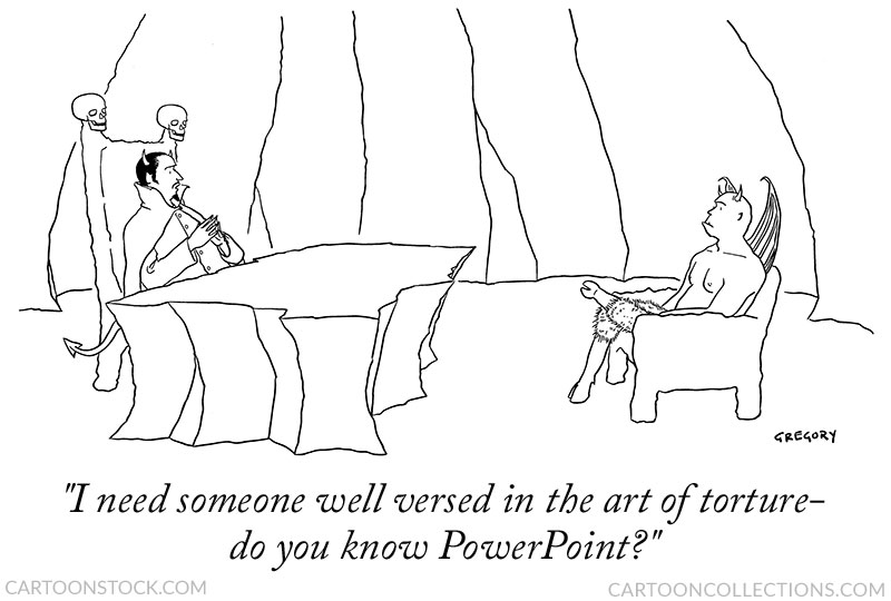
While “Death by PowerPoint” is, as far as I know, apocryphal, as a metaphor, it must have more than a grain of truth in it, or this cartoon wouldn’t still be funny.
I say still because the cartoon was done by Alex Gregory back in 2003 when PowerPoint had already been in use for 16 years.
The metaphor and Gregory’s cartoon nicely sum up our love-hate (or sometimes hate-hate) relationship with this much used, but not always loved, presentation software. However, the problem is not with the program but with us.
Well, maybe both.
PowerPoint offers an embarrassment of riches in terms of fonts, colors, and shapes with which we can embarrass ourselves and torment our audience.
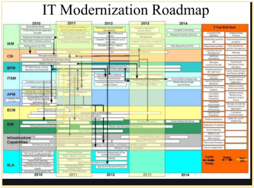
Admittedly, I’ve picked a pretty horrendous example.
But even without clashing colors and font mania, virtually all the information in a typical-looking PowerPoint presentation slide will be forgotten quickly.

How quickly? Close your eyes and count to thirty.
Now tell me what you can remember from the slide. Hey, no peeking!
Studies show that 90% of what you saw will be gone in 30 seconds. But you don’t need a study to tell you how bad your short-term memory is. I just showed you.
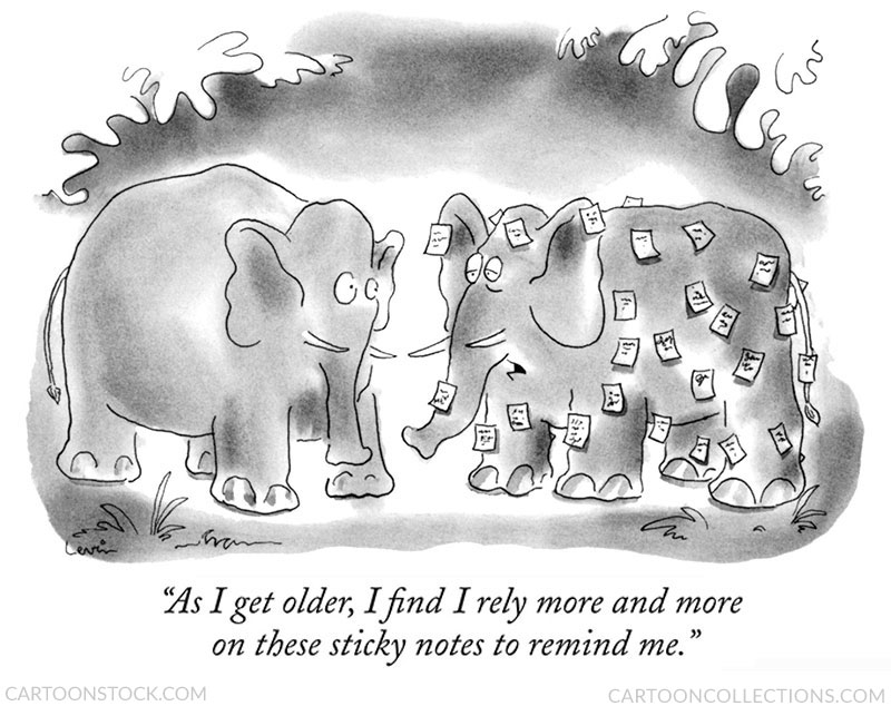
The fact is that our short-term memories are really short and, by the time you get to my age, are usually shot.
A related concept called our “working memory” – roughly how much information we can hold in our minds temporarily to reason and guide decision-making – is also quite limited. There’s a puzzle game called “Spelling Bee” in The New York Times that illustrates this.
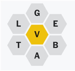
The object is to make as many words as you can with these seven letters, but each word has to contain the center letter, in this case, “V. If I don’t have the image in front of me, I can always remember the center letter, but I have trouble retaining other letters without constantly referring back to the image.
But when I realize that all the letters can spell “VEGETABLE,” retention and manipulation of the letters become manageable even without the reference image. The word vegetable acts as a mnemonic device to tie all the letters together.
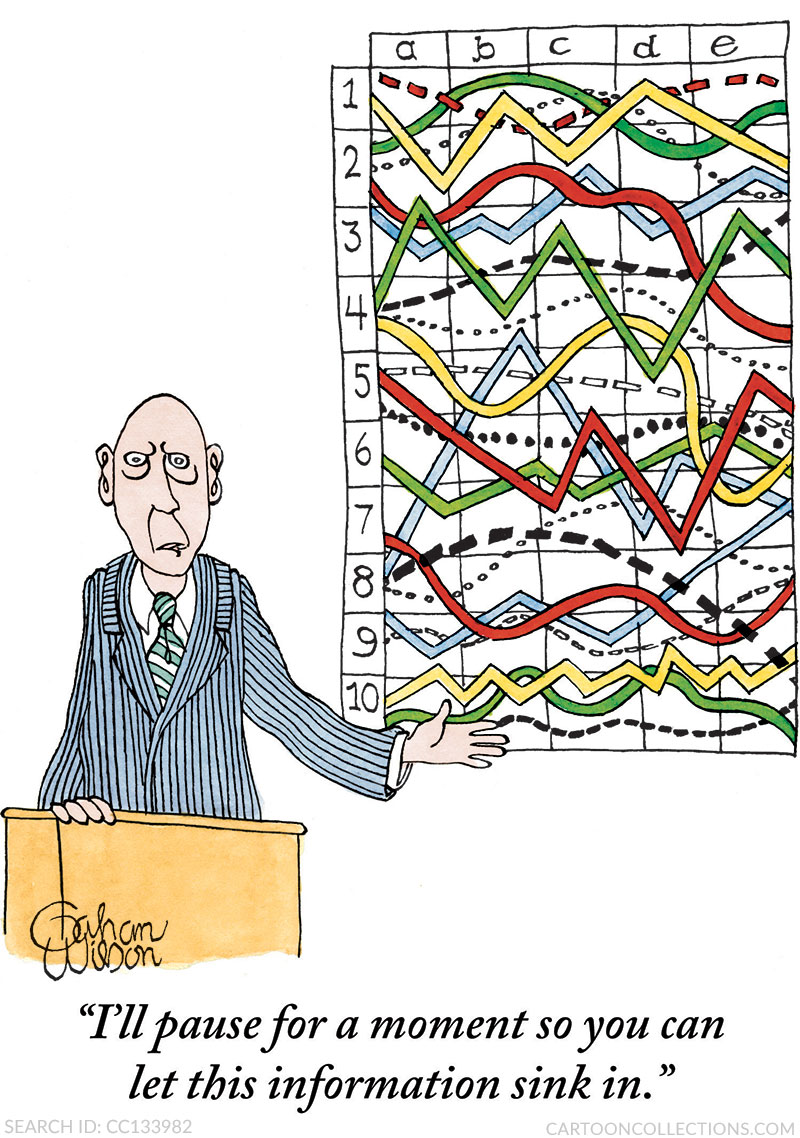
In a similar way, cartoons used in a presentation can act as memory anchors for your key points. Following is an example by Gahan Wilson that nicely sums up this email.
Below is an example of how The Red Cross Climate Initiative used Avi Steinberg’s cartoon in a slide presentation to call attention to the difficulty of achieving consensus:
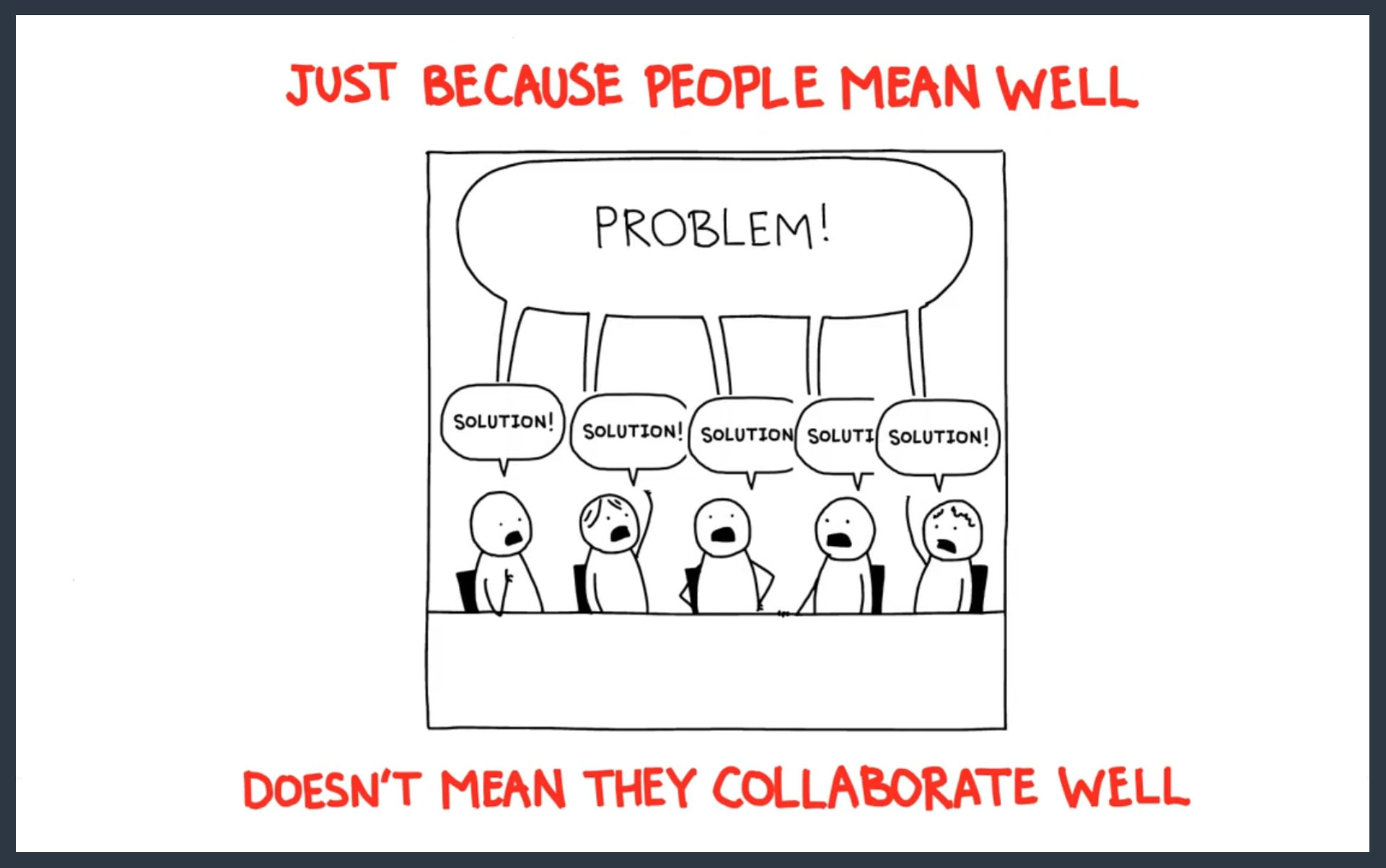
The cartoon illustrates the challenge of well-meaning collaboration in a friendly, memorable way that allows the viewer to understand and connect with the idea.
Because we have cartoons on thousands of topics, I’m sure you can find the perfect cartoon to help you make your message memorable. And if you can’t, contact us and we’ll be happy to help.
Yours in Good Humor,
Bob


