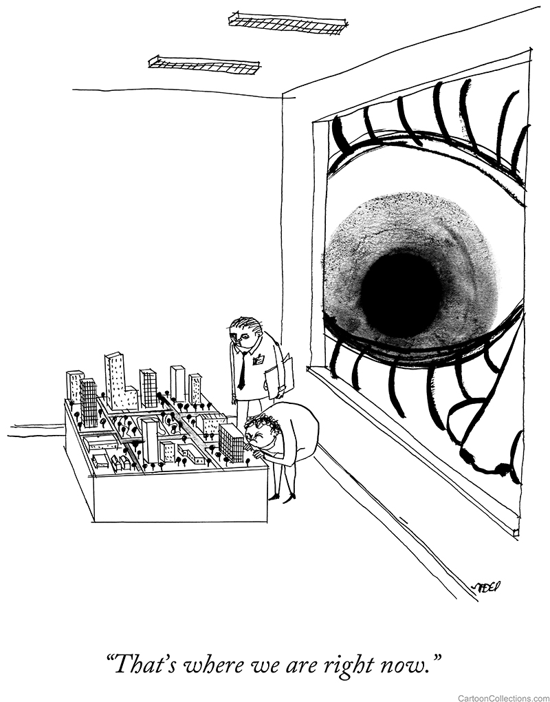
 Cartoon critics Phil Witte and Rex Hesner look behind gags to debate what makes a cartoon tick. This week our intrepid critics take a look at the more eccentric among us.
Single-panel cartoons are executed in an astonishing range of styles; however, most share artistic conventions—such as perspective—that render the image intelligible to the reader. Cartoonists want the audience to “get” their humor at a glance. Art that calls attention to itself can distract from a conventional gag. The result is a sea of similarity.
A small group of iconoclastic cartoonists ignores artistic constraints to forge a deeply personal style. Their art can be off-putting to first-time viewers. Like any acquired taste, subsequent views reward deeper appreciation. The humor of these artists does not rely on clichés. It veers into the ironic, the macabre, and the just plain bizarre. We call this group “The Eccentrics.”
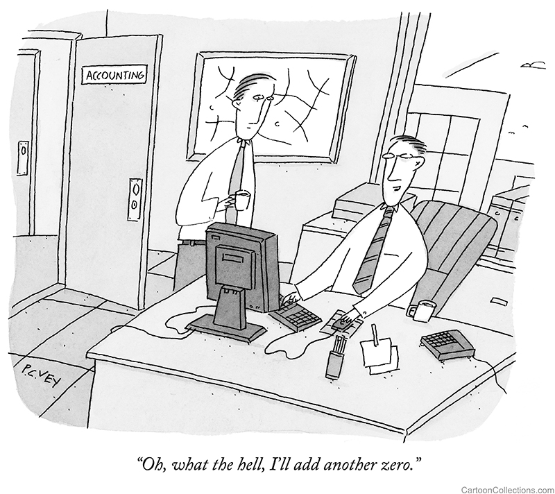
One of the foremost practitioners of an eccentric style is P.C. Vey, whose cartoons appear in many publications. Here’s a standard cartoon locale, the office, as he envisions it:
BUY THIS CARTOON
Perspective is not ignored—the computer and other objects are drawn in three dimensions—but distorted and flattened. The point of view wavers and drifts throughout the drawing, and the room sinks disconcertingly to the right. Outside the window, buildings lean like Pisa’s tower. And what about these strange-looking office workers, with their tiny hands, absent shoulders, and lines under their eyeballs? It’s all part of Vey’s unique style.
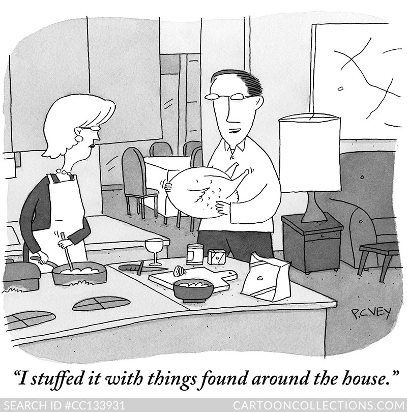
Another example:
BUY THIS CARTOON
There’s far less distortion here—although the kitchen counter is oddly curved—and a lot of detail, including a dining room to the rear. Yet, the central figures are flattened, and much is abstracted. But who can deny that the off-kilter artwork works perfectly with the gag?
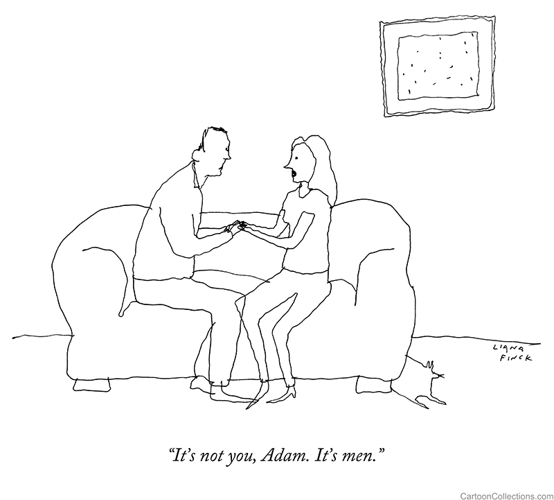
Just as “naive” is a term to describe an untutored artistic style, there is a naive cartoon art form. Liana Finck’s art has a child-like quality to it. But then Picasso once said, “It took me four years to paint like Raphael, but a lifetime to paint like a child.” Here’s what we mean:
BUY THIS CARTOON
This is a minimalist drawing, but the basics are there, and that’s enough to get the gag across. The thin, wobbly line lends a sense of fragility to the scene. And almost in the middle of the cartoon, her knee crosses in front of his knee, but doesn’t block our view of it. Again, the hands are tiny, and the faces almost featureless. A framed piece of “art” consisting of tiny scratches hangs crookedly and perhaps ironically on the wall. Yet, the scene is tender, in contrast to the humor, which is devastating in its understatement.
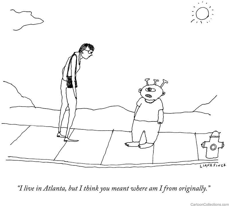
Unlike P.C. Vey’s work, Ms. Finck’s cartoons often don’t even rely on shades of grey to convey depth or distinguish objects. This style is challenging because of its utter simplicity. Here’s another one of hers:
BUY THIS CARTOON
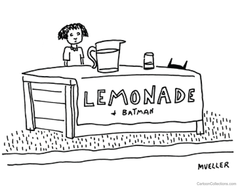
How far can an image be stripped down without losing its comic punch? P.S. Mueller draws only the most basic elements, yet his style is wedded perfectly to his wildly unconventional humor. With no caption, the drawing does all the comic lifting, as seen here:
BUY THIS CARTOON
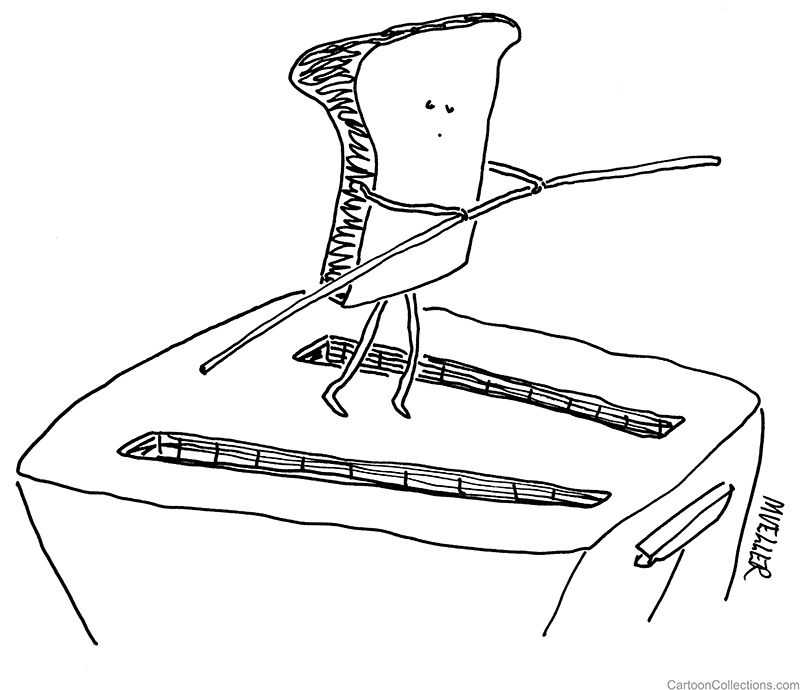
Like Ms. Finck’s best work, P.S. Mueller’s cartoons can be both funny and charming:
BUY THIS CARTOON
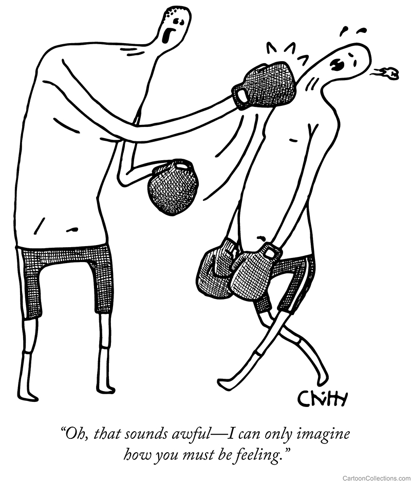
Tom Chitty draws human figures in a uniquely weird style. The distortions can be off-putting: no noses, no ears, grotesquely tiny heads, noodle arms and splayed legs attached to abstract torsos. Yet, the cross-hatching is done with infinite care. This artwork is jarring, not unlike some contemporary art.
BUY THIS CARTOON
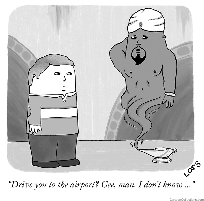
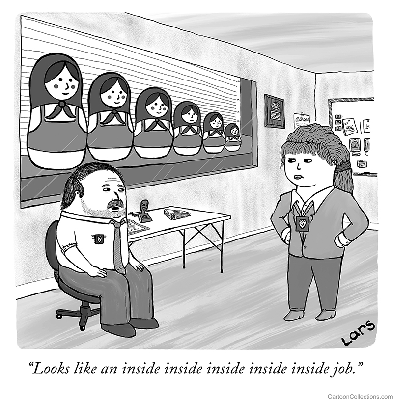
A more playful example of distortion is found in the cartoons of Lars Kenseth. HIs capsular people resemble toys.
BUY THIS CARTOON
Another cartoon of his combines the nesting dolls cartoon trope with the police line-up cliché. Whether an intended effect or not, the cops themselves resemble nesting dolls.
BUY THIS CARTOON
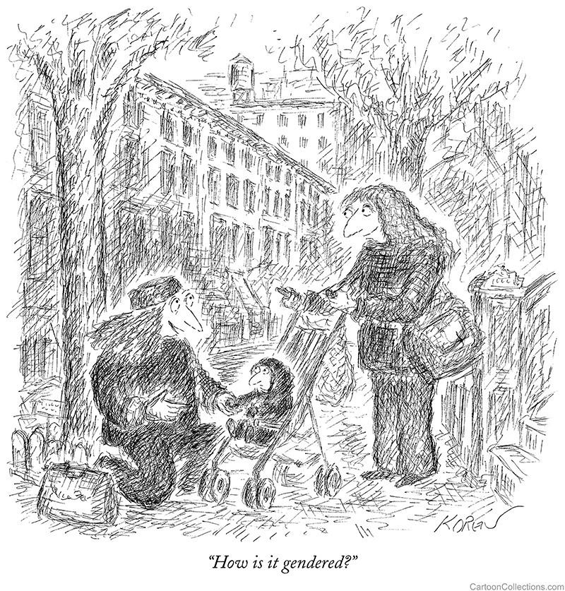
Long-time New Yorker contributor Edward Koren is another cartoonist whose work features charmingly odd people-creatures with bird-like beaks. Even the tyke below has a beak.
BUY THIS CARTOON
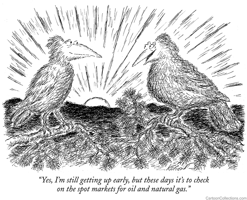
The faces on these birds are almost interchangeable with the human faces in his cartoons.
BUY THIS CARTOON
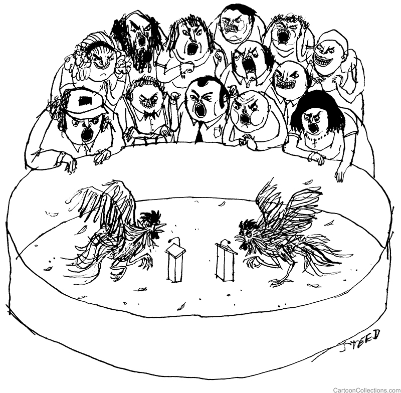
No one would suggest Edward Steed’s characters are charming. Rather, he delights in depicting humanity at its worst.
BUY THIS CARTOON
He employs a thin, sometimes irregular line, but the resulting images are wildly animated—even alarming:
BUY THIS CARTOON
Unusual art matched with a bizarre sense of humor—that’s the hallmark of Edward Steed’s work … in a word, eccentric.


