 Cartoon critics Phil Witte and Rex Hesner look behind gags to debate what makes a cartoon tick. This week our intrepid critics examine the drawing behind some favorite cartoons.
Every budding cartoonist faces a dilemma: the tools are at hand, coffee’s on, and the ideas are brimming over –- now what? Sure, the gag’s great and your caption is a comedic gem, but what about the drawing?
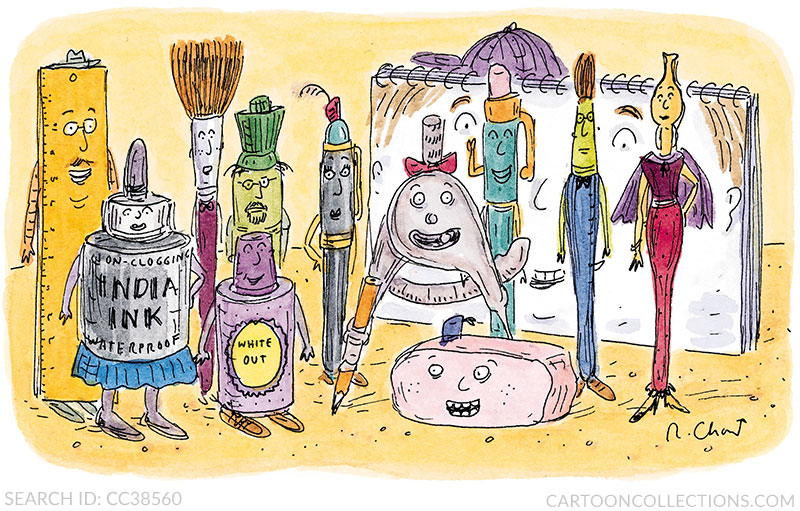
The first step for generations of cartoonists is to acquire a set of drawing tools, as captured below by Roz Chast. Note how each item beckons to help create that future New Yorker masterpiece.
BUY THIS CARTOON
Most cartoonists turn to the previous generation of artists for guidance. Here the universe diverges into two camps: those who primarily use lines to create images, and those who combine lines with washes, cross-hatching, and other techniques to evoke the mood of the scene and convey a more three-dimensional effect. Let’s look at some examples.
BUY THIS CARTOON
Frank Cotham uses watercolor crayon to create his often somber scenes. Whether the image is a classic tumbledown shack, as here, a 19th century duel with pistols, or a retreating colonial army, the moodiness of his drawings mirror the dark themes from which his humor improbably emerges. From the yard detritus to the dog yowling in the pickup truck beneath the glowering sky, this cartoon evokes a scene rich in detail and deep shadows.
BUY THIS CARTOON
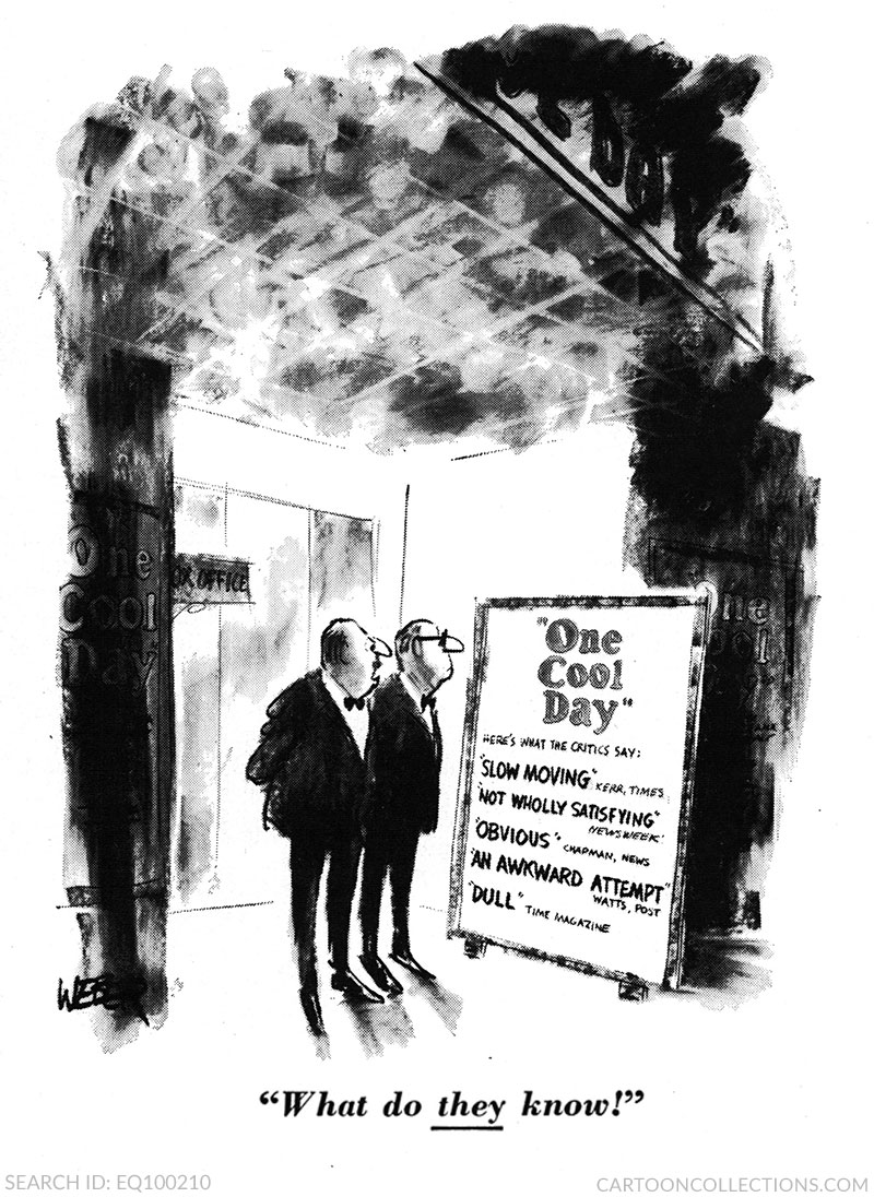
Cotham cites Robert Weber as one of the cartoonists who influenced his style. The mood of Weber’s tuxedoed impresarios match the deep black washes of this 1966 Broadway flop gag. The blacks and grays are splashed on almost casually, set against a brightly lit wall, adding drama to the scene. The complex, multi-hued ceiling is worth a second look, as are the little details, like the shine on the mens’ shoes. Remove the skinny-legged characters, and the blacks and grays suggest abstract art. This is the work of a master.
BUY THIS CARTOON
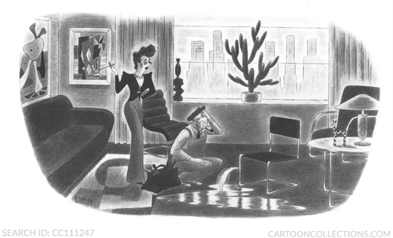
An earlier influence on Frank Cotham’s style, he has told us, is Richard Taylor. The range of grays in his 1941 caption-less “Confused Plumber” cartoon is truly extraordinary. The water on the floor practically shimmers. The play of light and shadow also gives shape to the multi-curved chair behind the woman, and helps to distinguish the cushions on the couch from the back and arms. The artwork on the wall of this swanky apartment is meticulously rendered in shades of gray. And the woman is set off from the curtains in an aura of light gray. This precise rendering is far different from loose work of Weber, but both use washes to great effect.
BUY THIS CARTOON
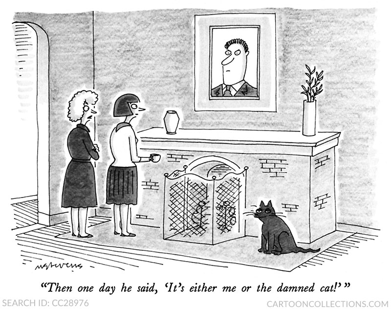
Another proponent of multi-toned drawings, Mick Stevens, creates this interior space with a combination of pencil shading and ink washes. Of course, anything dark will draw the eye’s attention, thus, the dark-hewed cat. The wash also helps to distinguish the women, both by hair color and manner of dress.
BUY THIS CARTOON
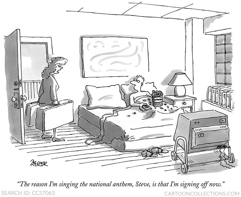
Mick Stevens’ mentor and friend, the late Jack Ziegler, published nearly 1,200 cartoons in The New Yorker. This 1997 gem captures a bedroom scene with enviable assurance. From the weight of the packed bags to the rumpled bed and old school TV, this composition is solidly constructed. The repeated rectangular shapes—the wall art, bed, suitcases, ceiling tiles—subtly tie the image together. The light source appears to be from the TV, casting shadows throughout the room.
BUY THIS CARTOON
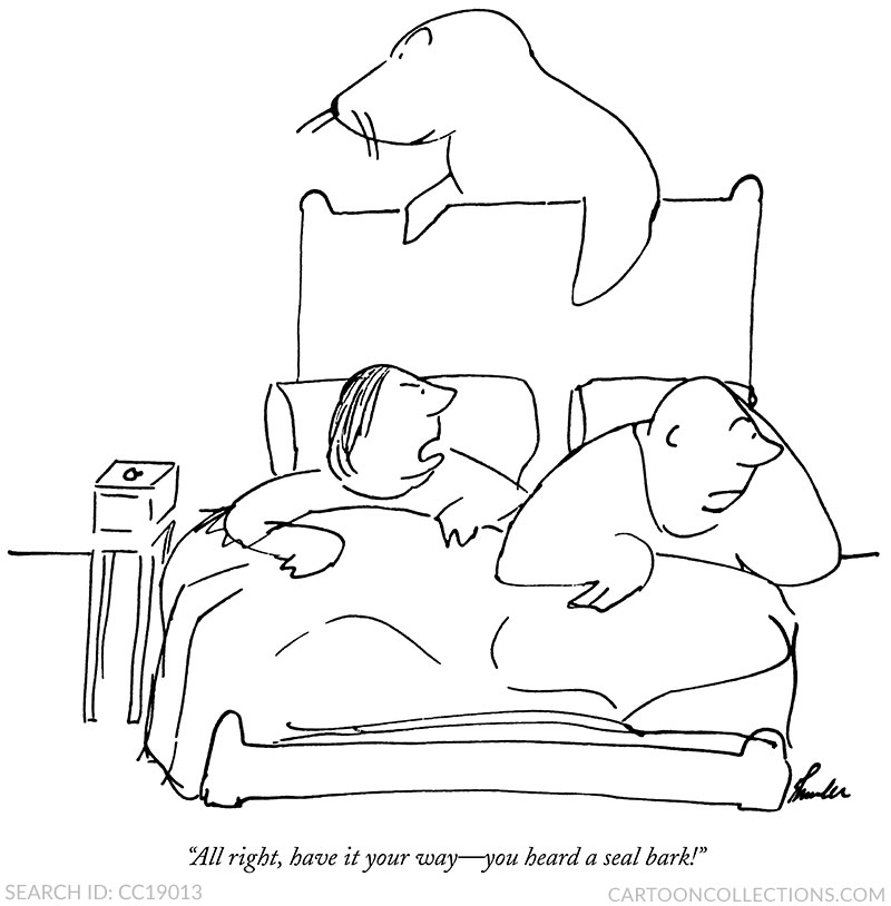
In the other direction, some cartoonists eschew shading or washes in favor of a more direct connection using only lines. James Thurber was the early master of the understated line drawing. In his classic 1932 drawing, depth is suggested through the foreshortening of the bed and clever positioning of the seal. All the elements are there to communicate the gag with immediacy.
BUY THIS CARTOON
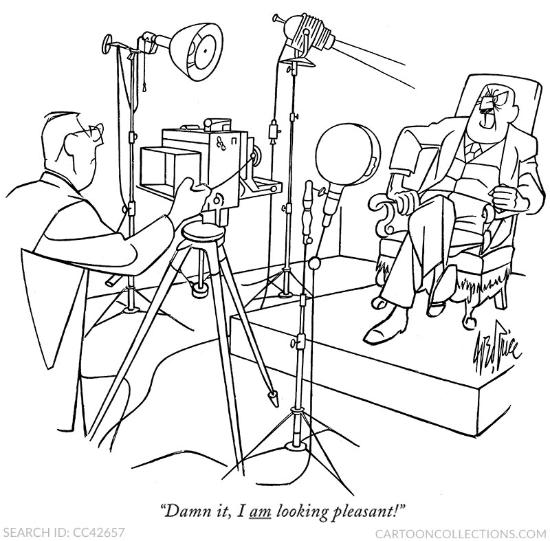
A later cartoonist, George Price, used a more precise line. So assured is his style that even complex images appear almost to have been drawn as one continuous line, without his pen leaving the paper. Perfect perspective lines create depth. Every line is meticulously drawn and serves a purpose. The hyper-realistic camera equipment contrasts with the exaggerated expression on the portrait sitter’s face. Although Price sometimes included a generic gray wash, it seldom added much to his cartoons; a pure line of unvarying thickness was his artistic strength.
BUY THIS CARTOON
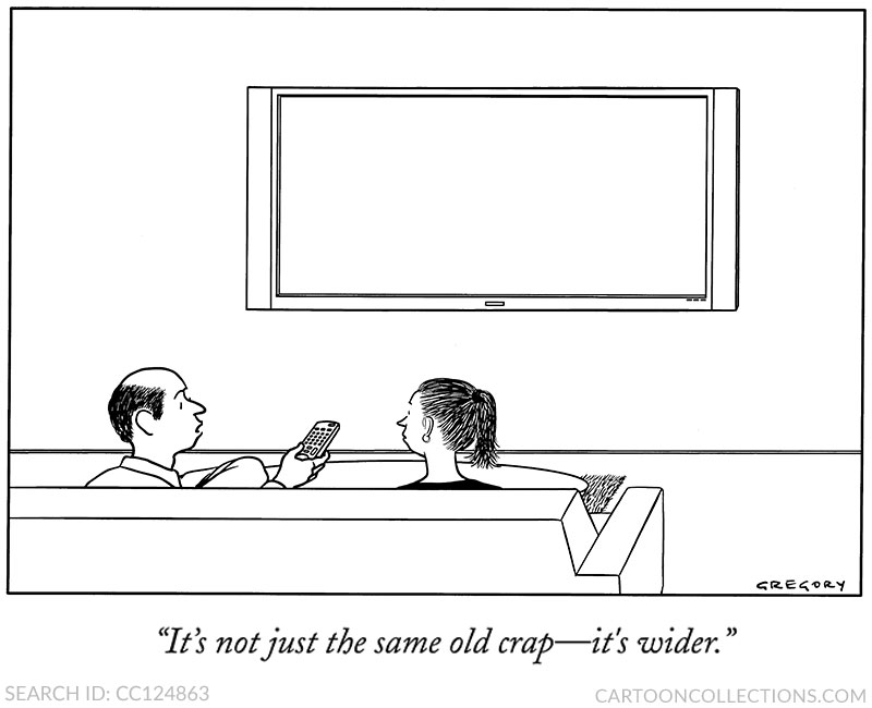
The line art tradition has continued with the work of contemporary cartoonist Alex Gregory, who told us that Price was one of the cartoonists who influenced him. That influence is clear: Gregory’s line is precise and has the same unvarying thickness, although the compositions are often more spare than Price’s and the facial expressions seldom betray much emotion. In addition, Gregory occasionally uses solid blacks, as seen on the woman’s top, and hair usually receives additional line attention.
BUY THIS CARTOON
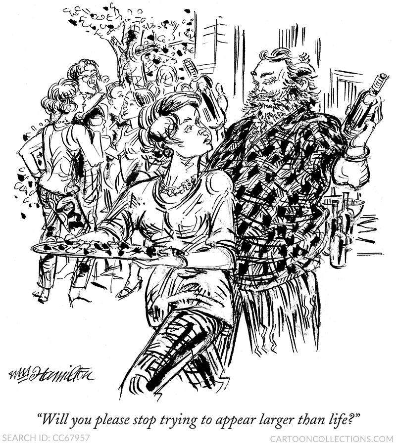
Falling in between the simple line cartoon and the highly rendered cartoon is the drawing that uses plenty of black ink, not wash, to create shapes and patterns. One of the best practitioners of this technique was William Hamilton. His cartoons nearly always place the emphasis on people (affluent, white, middle-aged people), drawn with many fine lines, almost none straight. While his style may veer toward line art, black accents abound; the black strokes on the woman’s leg appears almost painterly.
Is one style “better” than the other? A simple gag may need nothing more than a few pen strokes. A more highly rendered drawing may cause the viewer to pause a few extra seconds to observe and admire the additional artistry. Ink washes can add mood and help to give shapes fuller dimensions, but a flat image can be just as effective as a cartoon in many shades of gray.
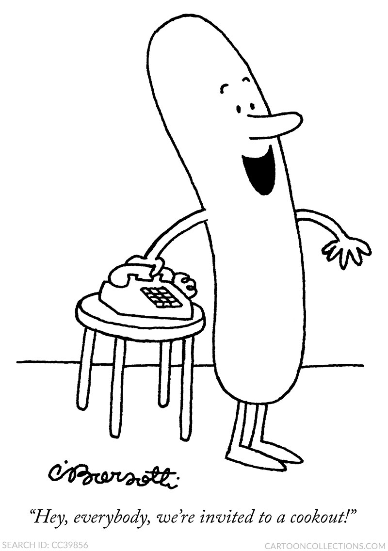
We conclude with a cartoon by a master of line art, Charles Barsotti. The scene: a phone, a stool, and a happy hot dog. The line is as simple as can be. But simple does not mean easy. Each line has to be perfect. In this cartoon, it is.
BUY THIS CARTOON


