Cartoon critics Phil Witte and Rex Hesner look behind the gags to debate what makes a cartoon tick. This week our intrepid critics take a look at marketing.
Despite the rise of the “new economy” and internet purchasing, one element of consumerism still drives sales. No, it’s not quality or customer service (ha!) or even price. It’s marketing. If anything, given the ever-increasing amount of stuff available, marketing has become even more important. And important things are what cartoonists lampoon.
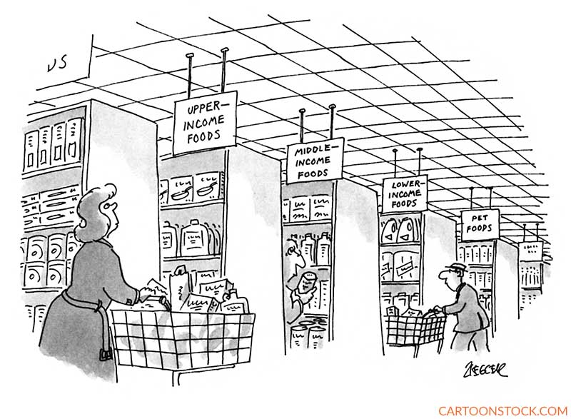
We start with a few pairs of cartoons to compare and contrast. The supermarket is the setting of two caption-less cartoons. The first, by legendary cartoonist Jack Ziegler, mines class distinctions for humor, and takes a dark and daring turn at the final aisle.
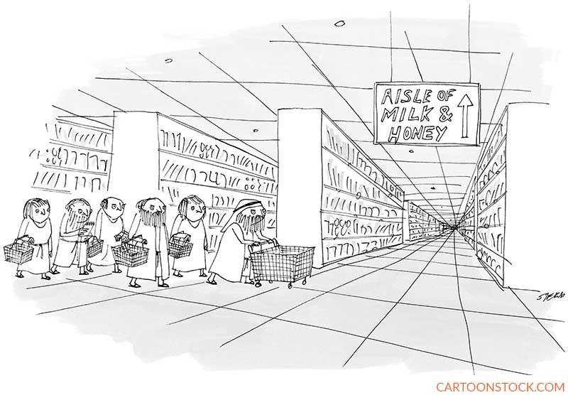
Like the Ziegler cartoon, the next cartoon, by the highly original Edward Steed, is based on signage, but it’s not the signs that are funny—it’s the absurdity of the scenario. The cartoon relies on anachronism, of course, as well as the cartoon cliché of Moses leading the ancient Israelites. But instead of a dramatic scene of Moses parting the Red Sea, descending Mount Sinai, or beholding the burning bush, we see the Hebrew hero performing a ridiculously mundane task. A nice touch: Moses has a wheeled shopping cart, while his followers must make do with baskets.
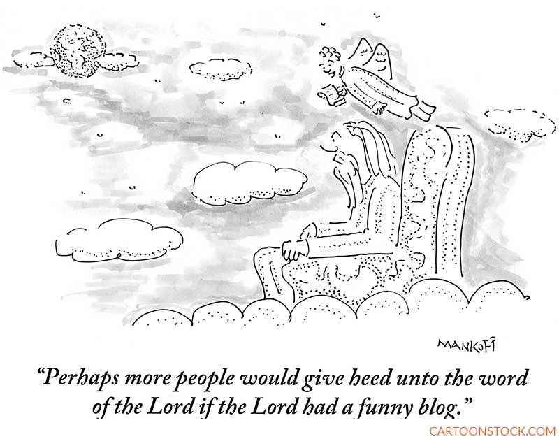
Speaking of religion, two other veteran cartoonists rely on a go-to cartoon location—Heaven—to consider marketing. First up, Bob Mankoff suggests that God may not have all the answers, at least when it comes to getting His message across. This cartoon achieves extra comic oomph with a caption that uses archaic language to propose a modern approach to marketing.
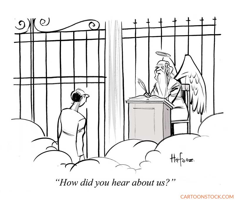
Kaamran Hafeez’s cartoon, set at St. Peter’s gate, likewise inserts the modern concerns of marketing into a Bible-inspired scene. Despite the wings and halo, the saint seems more interested in the source of his business than in the souls of would-be admittees.
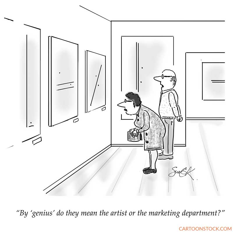
Our next pair looks at marketing in the fields of art and literature. Susan Camilleri Konar has created a cartoon that strikes a chord in museum-goers who may not appreciate the art as much as the curators do. The wife’s posture suggests that she is considering the artwork more deeply than the husband, who stands farther apart from the paintings, which explore lines and dots in their many variations.
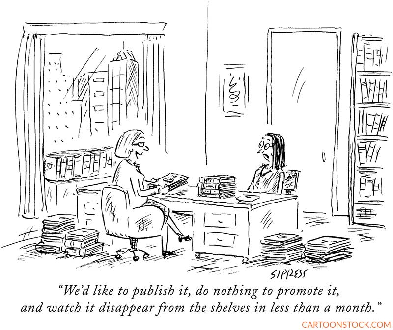
As authors know, without the power of a big publisher’s marketing arm, a published book is likely to be remaindered. This truth is so obvious that it’s a wonder publishers don’t simply tell it like it is to writers—except in the cartoon world, care of David Sipress.
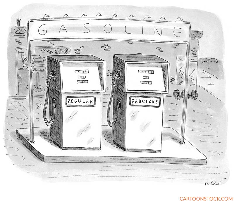
Our final compare-and-contrast cartoons (but not of this blog) are by the same cartoonist, Roz Chast, at different points in her storied career. The first one, published in 1995, is based on a single word not normally associated with petroleum products. It’s instantly funny.
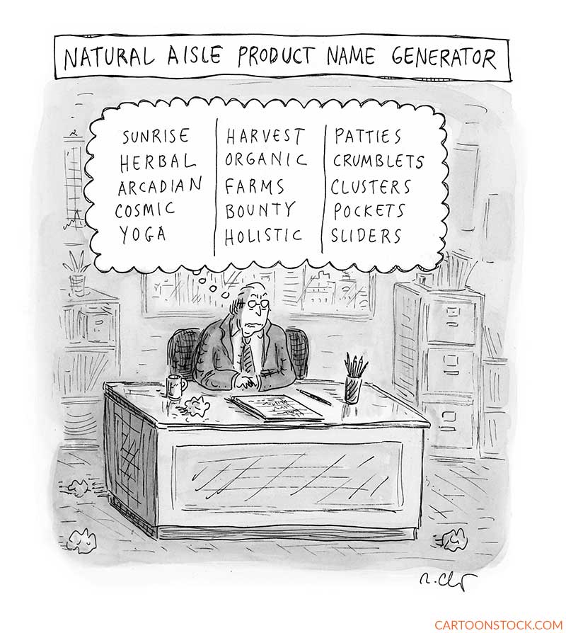
Over the years, her cartoons became more complex, often involving multiple characters expressing related sentiments. This cartoon from 2021 invites the reader to linger over the many possible word combinations, from plausible to nutty. Note the guy’s grimly determined expression and the crumpled paper balls.
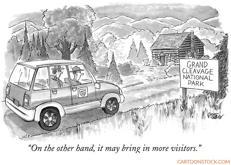
Just the right word to evoke a certain yearning is often the key to successful marketing. Peter Steiner has the National Park Service in mind, in case it wants to boost park attendance. As for the artwork, the many variations of gray are worth a closer look.
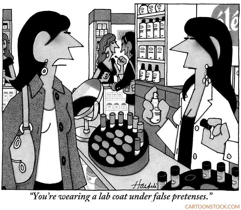
One-on-one marketing, from sales rep to customer, can be very effective, but if it involves deception, the customer will likely take offense. William Haefeli takes aim at the women behind cosmetics counters. As always with his cartoons, there are many wonderful artistic touches, for example, the reflection in the circular mirror and the brand name whose two of three visible letters include an accent aigu.
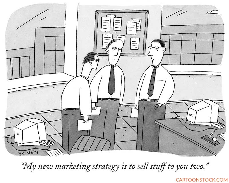
Better than one-to-one marketing is one-to-two marketing. The guy in P.C. Vey’s cartoon has come up with a strategy that seems both short-sighted and short-term. For understated absurdity, P.C. Vey is tops.
Turning marketing into sales is the key, of course. The commuter in this cartoon by Drew Dernavich sees no irony in the book’s title. The cartoonist’s style is both bold and spare, excluding all but the essential elements of the gag.
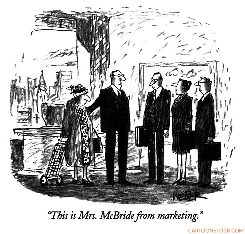
Our final cartoon, by the great Robert Weber, is more than just a work of clever wordplay. The composition and artwork make the cartoon soar. On one side of the executive office are four black suits. On the other is a frumpy-looking woman in a print dress holding onto a wheeled grocery cart familiar to New Yorkers. The facial expressions range from serious to slightly bemused. In the distance looms what may be the spire of the Chrysler Building. All is presented in an almost offhand manner, with stray marks indicating a wall and ceiling and murky darkness to indicate carpet. Superb.


